25 Jul 2013
Google's New Phone: A Lesson In The Dangers Of Gesture-Heavy
In building a minimalist UI for its much-anticipated Moto X, Google has gone too far, replacing traditional navigation tools with a host of overly complicated gestures.
Interacting with touch-screen devices is a process already flooded with gestures. We spend so much time swiping, pinching, poking, dragging, tapping, and shaking our devices that it must look like we’re simulating a fencing match with our index fingers, rather than playing with our beloved smartphones and tablets.
But this week, we saw how far this already gesture-overloaded world of touch interactions could go. In leaked screenshots said to show the software piloting Google’s much-anticipated Moto X smartphone, we got a look at the latest version of Android, which distances itself from traditional navigation tools (buttons, icons, menus) in favor of a cleaner (if not nonexistent) interface that heavily relies on what’s not displayed on screen--that is, the invisible gestures we use to control our gadgets. It signals a future where an ever-growing list of interactions is not immediately intuitive but taught to us instead.
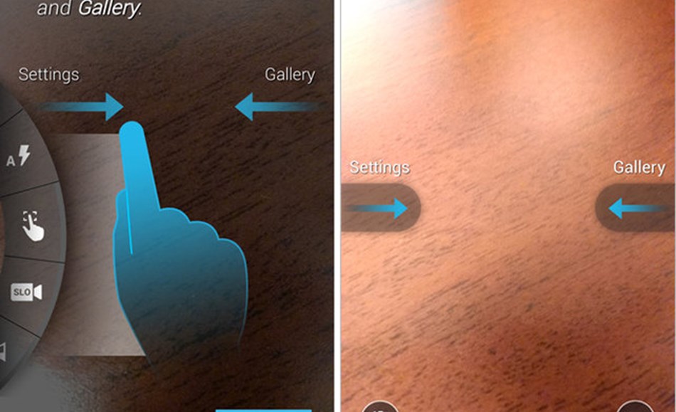
As the report spells out, the new Moto X software features a "minimalist" experience, with a "big focus on gestures and unobtrusive controls." However, the interactions are not so much minimalist as they are complicated, and the controls are not so much unobtrusive as they are invisible. In the leaked photos, for example, which reportedly highlight the Moto X’s camera interface, we see a slew of gestures that are novel but far from immediately obvious. In addition to a number of interactions that are accessed by swiping from the edge of the phone--to bring up the camera’s settings or a gallery of photos, swipe from the left and right edges of your device--there are interactions that require training to use. Indeed, the new software apparently comes preloaded with directions when you first use the camera service, including:
- "Drag up and down to zoom"
- "Twist your wrist twice, quickly to launch camera anytime"
- "Tap anywhere to take a photo, hold for multiple shots"
It serves as a reminder that "minimalism," as the report refers to it, if too stripped down, can simply be confusing. Steven Sinofsky, the former head of Microsoft’s Windows division who oversaw its dramatic redesign of Windows 8, was one of the first to call out Google. "Wonder if this will come with a training video, in-store help, and a printed manual?" he tweeted sarcastically.
That’s not to say unique and novel gestures are bad. They can serve as smart, simple, and often fun ways to interact with your device, and we’ve seen them implemented in brilliant and elegant ways, such as with apps like Clear and Mailbox.
"Wonder if this will come with a training video, in-store help, and a printed manual?"But we’ve increasingly seen the need for tutorials when introducing an app’s set of tools--the digital equivalent of IT manuals. While these tutorials are lightweight and easy to understand--usually displayed as a transparent overlay atop of your app--they’ve started to feel more like a football coach’s playbook, with arrows and lines delineating directions. Sometimes they’re worth the lesson--Paper’s iPad app, for example, teaches us to move our finger in a counter-clockwise motion to rewind through our history--but they also can often feel unintuitive. Requiring a user to twist his or her arm--twice, rapidly--to launch a camera? That’s perhaps going too far: You’ll start to feel like Harry Potter learning a new wand motion at Hogwarts to play a trick on Draco Malfoy.
The larger problem here is that these interactions are often app-specific and not universal. So while we might learn a new set of gestures, say, for Google’s camera app, they likely won’t apply to a different Android camera, let alone a product from Apple or Microsoft. Our library of gestures becomes even more fragmented in the developer world, with each startup’s new app featuring this new style of swiping or that new way of tapping.
The larger problem is that these interactions are often app-specific, not universal.
It’s why we’re often eased into learning more gestures over time, usually for basic funtions: It takes time to learn them and we can only learn so many. So while Loren Brichter’s now-famous pull-to-refresh interaction was first introduced on the iPhone through his third-party Tweetie app, its design DNA eventually migrated to countless other services, including Apple’s mail client. Why? Because it was such a core function that it required a gesture--and a simple one at that. Just because we have touch devices with accelerometers does not give app makers the excuse to overwhelm users with gestures, especially if they’re unnecessary and complicated. In fact, an early member of Apple’s iPhone team once told me the company had considered implementing a range of gestures for the original device--but the team quickly realized they were far from intuitive. The reason? Because Apple understood users would need a manual to know how they work.